Google Apps - Looking at the New Drive
One of my Google Accounts has access to the "new" look of Drive. There are several key differences that are worth noting if you are changing over! Here are 5 of the ones I think will impact people the most.
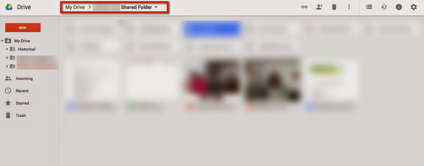
1. New Look with Breadcrumb trail - the look of drive has been updated (new fonts, shadowing of window, etc), but the best part about it is the addition of a breadcrumb trail so you can see where you actually are if you use nested folders.
2. Adding files - this has been reordered a bit so it is more noticeable that you can actually upload files into your Drive. Also, the three most use choices pop right up, the remainder fall under a "More" choice. This can be slightly annoying for those that use some of the "More" options often.
3. Change from "Shared with Me" to "Incoming" - strictly a naming change; when people share documents with you, they now go into a folder called "Incoming." (I think it will still be confusing to people, as if you want them in My Drive, you still have to take action.)
Here are the additional actions you can take with items shared with you:
4. Sharing has changed - the sharing of the file link and adding collaborators has been split, to make it more obvious that you can add individuals and/or you can share a link to the document. More on that in another post.
5. Additional actions - there are several other actions that can be taken via the icons at the top including switching to the list view (my personal preference), how items are sorted, and information that tells you the latest activity and the settings.


