Google Plus - Preview the Updated Plus!
This week was the first I've been able to preview the new Google Plus. Here are a few observations and comparisons (I put my work on the old and my personal on the new). My biggest take-away - it has a feel not too different than Google Classroom...
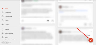
1. The New Home - Here is the change in looks - note the red banner across the top and the menu that does not need to be accessed by clicking. Also note that the icon for Hangouts is gone. In fact, it appears that Hangouts are no longer tied to Google +. The new post area is cleaner and the featured collections has been removed.
 |
| Older Google Plus |
 |
| Newer Google Plus |
4. Change in menus: The menu has changed - it has actually shrunk in options (new is on the left, old is on the right). Events, Hangouts and Pages are gone. Feedback and Help are moved up by Settings. Colors are also gone - I am wondering if they may come back and match the new color schemes of the different areas?
5. Color coded banners: The different areas now have different color banners across the top.
Collections - (old then new) much more graphical in nature
Communities - (old then new)
People - (old then new) note how their is no longer a listing of "Your Circles" at the top
6. Circles are moved: they are listed under "Following"...makes me wonder if circles may eventually go away? That would make me sad...
7. Posting has changed: Posting happens in a pop-up window now, not in the main window. There are only three options - to add images, links and location. Poll, event and video are gone. (The pop-ups with these are different as well.) You also have sharing options & settings (more below)
8. Post Share Settings: You now can click on the corner of your post and control if there can be comments on it, or if people can reshare it.
9. Post Share Options: When you click on the share options, it is now clear that you can pick a circle or community. I have to explore some more - on my personal account each circle was listed and I could only choose one of them (not multiple), while in my work account all my circles were listed together as one unit and I could only choose to share to all of the circles (not individual). Another reason to make me wonder if circles are changing or leaving....
10. Ability to share a post: Sharing a post is done in the corner now, and you have several options - including FaceBook and Twitter.
11. Options on post comments: Clicking on the corner of a post or comment, you have some options - including +1 on a comment, and removing your +1. Replying to a comment is also found here - it adds the person's + account name to it so it is directed to them within the comment change. This also changes on your own comments so you can edit and delete them.


